





Ready to Elevate Your Product Experience ?
Whether you're launching a new product or refining an existing digital product, I'm here to help. Share the details about your project and I'll get back to you to work something out.
Interior Design
Reimagined a generic office as a culture-driven workspace through strategic naming, visual branding, and environmental design, leading every stage from ideation to final execution.
Role
Sole designer
Duration
6 Weeks (2023)
Tools
Illustrator, Photoshop
Collaborators
Print vendor and Leadership
Before you read on
This one isn’t a digital product case study. It’s here because it shows how I think, how I take an ambiguous brief to a finished, installed result, and how I handle constraints I’ve never met before. If you only want screens, skip it. If you want to see design thinking work outside a viewport, stay.
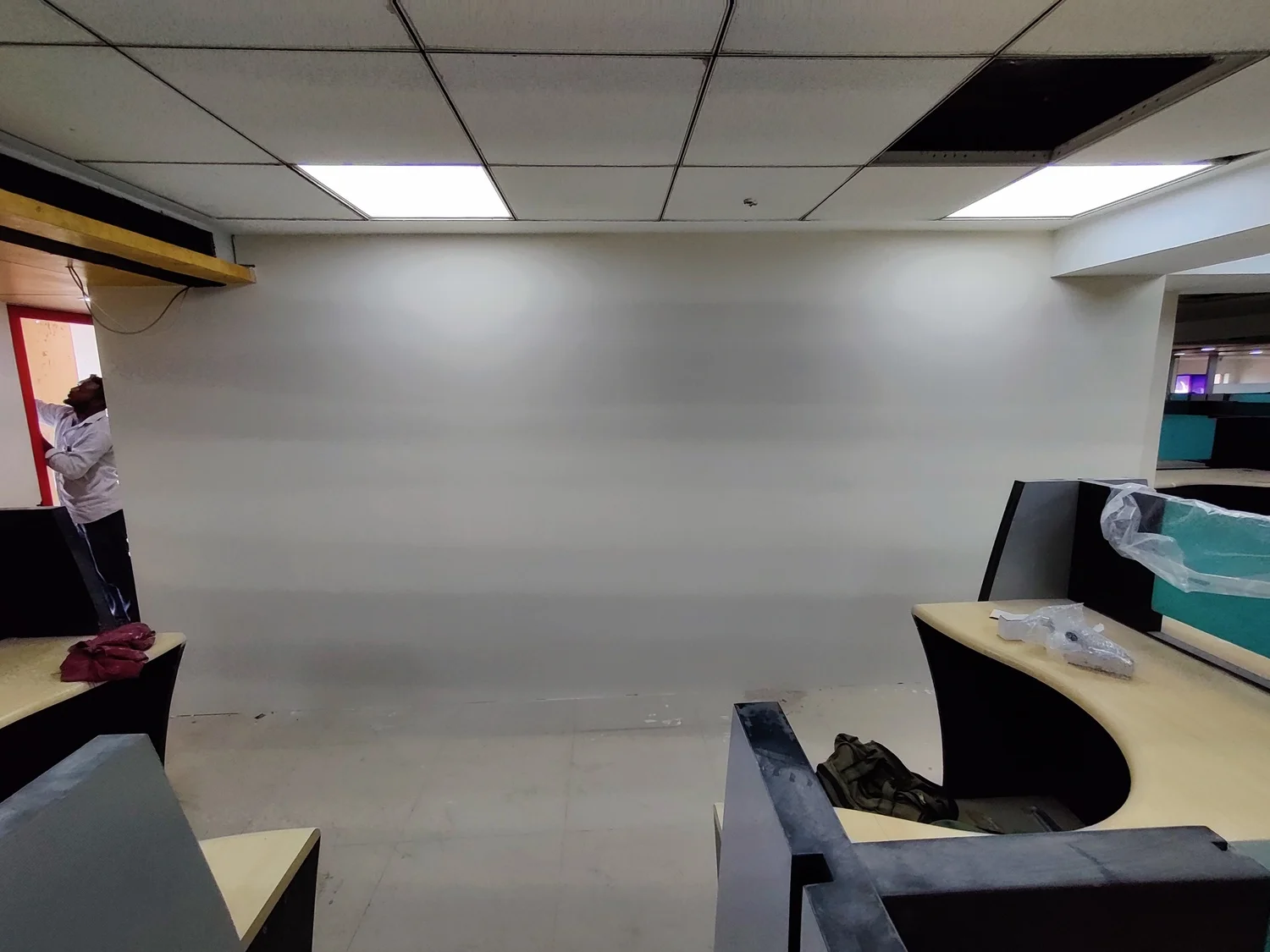
Raw office turned into branded space
Cabins renamed after U.S. cities
Print vendors evaluated before one was chosen
Creative Brilliance Award, company annual meet
Context
When I joined Avow Solutions we were 10 to 15 people. The company scaled fast and we moved into a 12,000 sq ft floor that wasn’t ready to use. An architect and contractor handled the structural work: which cabins to add, which walls to remove.
Midway through the renovation, my director called me to the site.
That was his entire brief. No scope, no reference, no budget conversation. As a UI/UX designer I had never done anything like this. But being trusted with an open canvas is rare, so I took complete ownership of it and started where any designer starts: by walking the space with the blueprint in my hand.
The problem
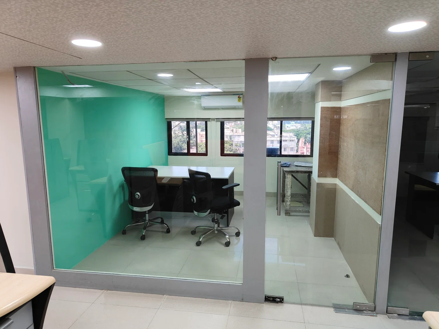
Walking the floor with the blueprint, the pattern was obvious. Cabin 1. Cabin 2. Conference Room 1. Every room was a number. Every wall was blank. The building was finished but the company wasn’t anywhere in it.
01
Replace generic room labels with names that carry meaning
02
Treat empty walls as surface area for brand storytelling
03
Give attention to the overlooked zones: corridors, restrooms, stairwells
04
Break the default office look with character and warmth
05
Build an atmosphere people actually want to spend their day in
Concept
We build logistics software that connects countries. So my first proposal was to name the seven cabins after the seven continents, a global theme mapped onto the business.
Early concept exploration, worked out against the office blueprint. My director liked the direction but pushed it further:
He was right, and it made the system tighter. Continents were abstract. Cities were specific, ownable, and carried their own visual vocabulary: a skyline, a bridge, a coastline.
That became the spine of the project: strategic naming with personality and purpose.

Naming system
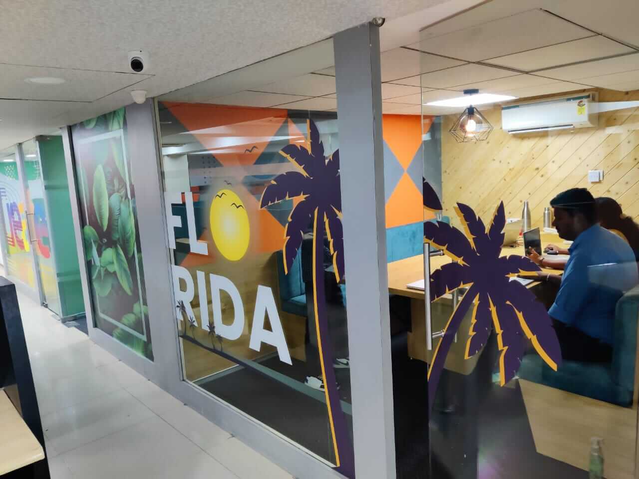
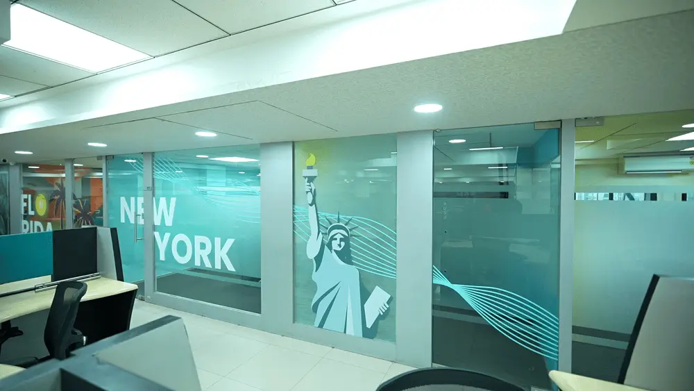
Names weren’t assigned at random. Each one was matched to the room’s function, layout and feel, so the label and the space reinforced each other. The finance room became Wall Street. The main conference room became New York.


Hey, Come to Cabin 3.
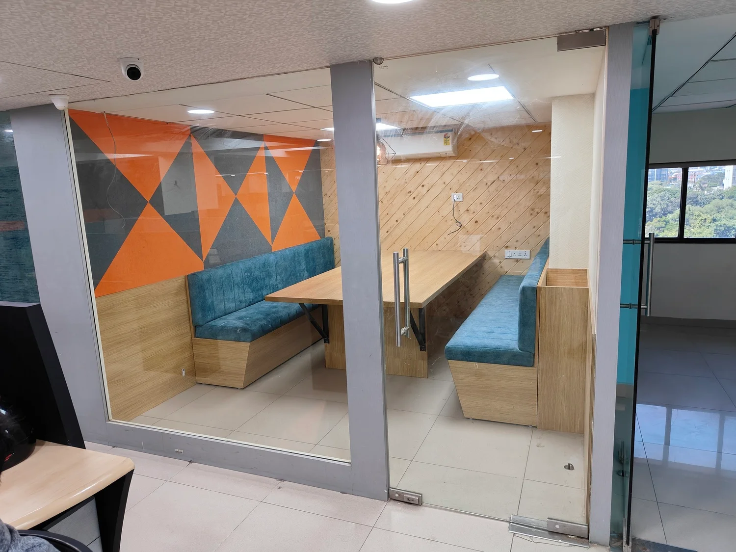
Before

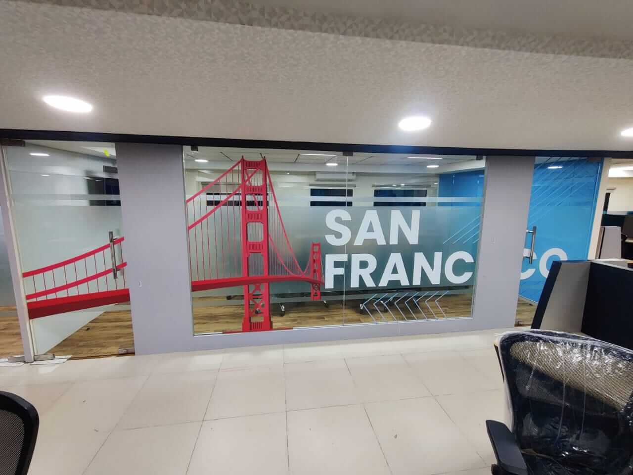
Let’s meet in San Francisco!
After
Instead of saying, “Come to Cabin 3,” people now simply say, “Let’s meet in San Francisco” or “I’m in Florida.”
Groundwork
Print has no undo. Once vinyl is cut and applied, a 5 mm error is permanent and expensive. So before opening Illustrator I spent time on site during construction, planning not just what to design but how it would physically live on the wall.
Measured every wall and glass panel by hand, so print dimensions were exact rather than estimated from the blueprint.
Photographed each zone at high resolution, building a library I could composite mock-ups onto later.
Guaranteed accurate alignment and scale across every surface, allowing me to pre-visualize the final outcome and refine the design before installation.
Made vendor coordination seamless by providing precise specifications and realistic mock-ups, eliminating surprises during installation.
Visual language
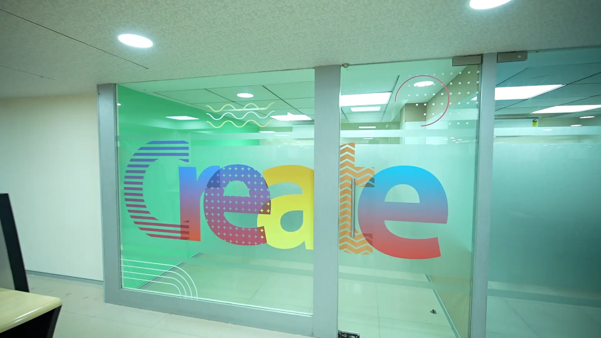
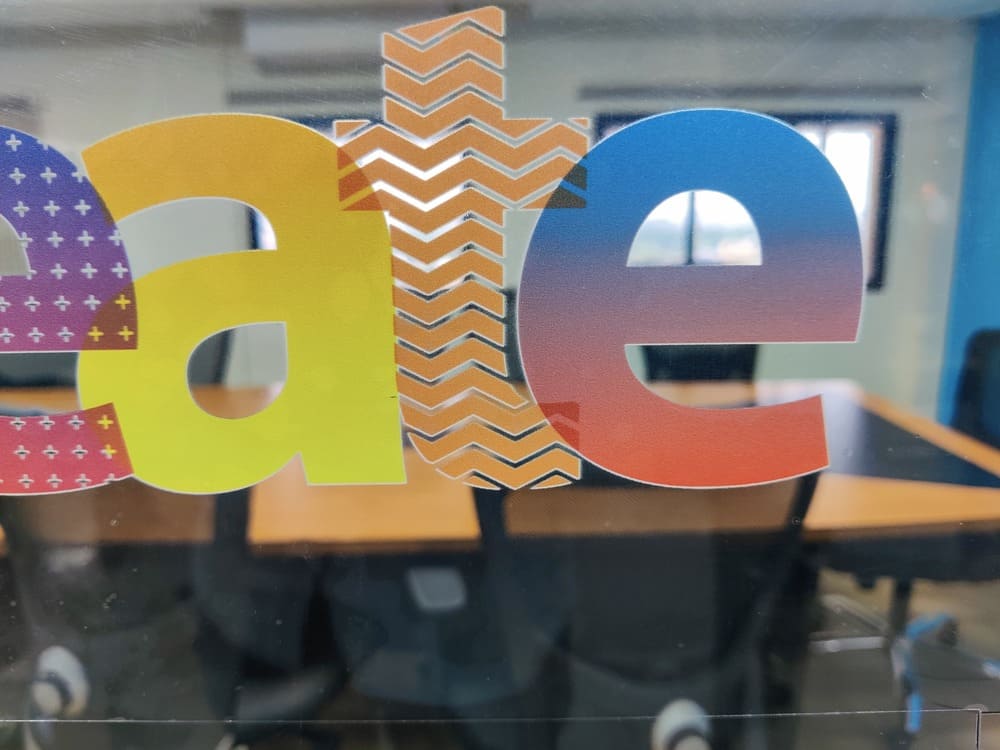
Every cabin had full glass walls, which is an unusually good canvas and an unusually unforgiving one. Anything heavy would block light and make the floor feel closed. So the system stayed minimal: a custom line illustration per room, symbolic of its city, printed on transparent vinyl with no background fill.
Design Tool
Adobe Illustrator (Design) and Photoshop (Mockup)
Aesthetic
Cabin text with Minimal design and colors
Medium
Transparent vinyl graphics with artwork only, no solid background
Production
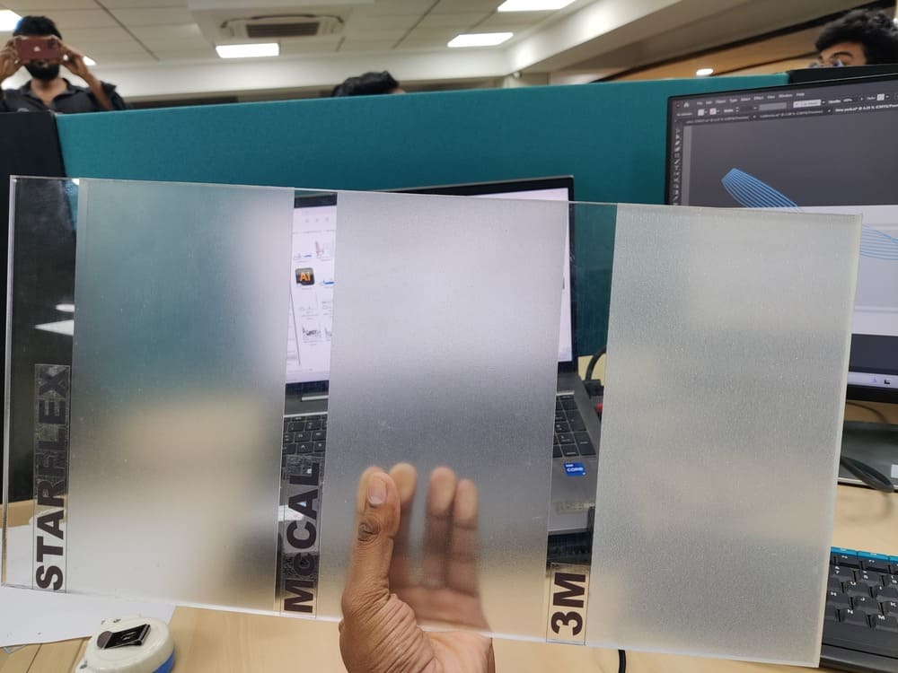
A design is only as good as the surface it ends up on. I went out and met more than twenty printing vendors: collected physical samples, asked about material grades and adhesive types, and compared frosted finishes side by side under office lighting. I only committed once I was sure a vendor could hold my colours and line weights at full scale.
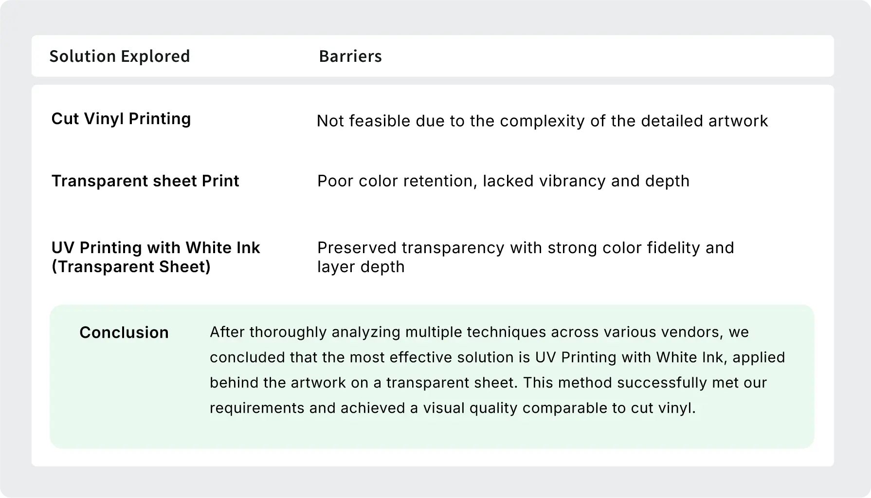
Frosted sticker variants, print finishes, material durability and colour consistency were all evaluated against each other before a preferred partner was locked in.



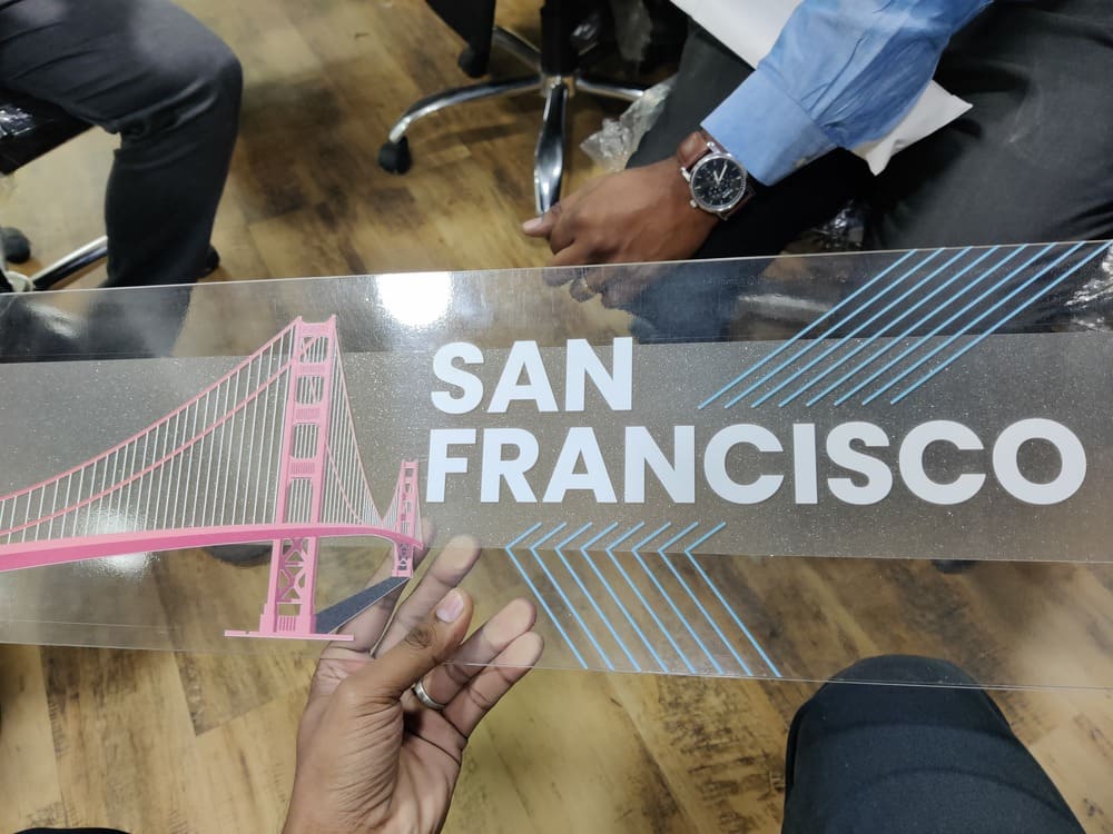
Execution
I insisted on pixel-accurate output, rejected the vendor’s “colour-corrected” alternatives, and stayed on site through installation. Drag any image below to see what changed.
Beyond the brief
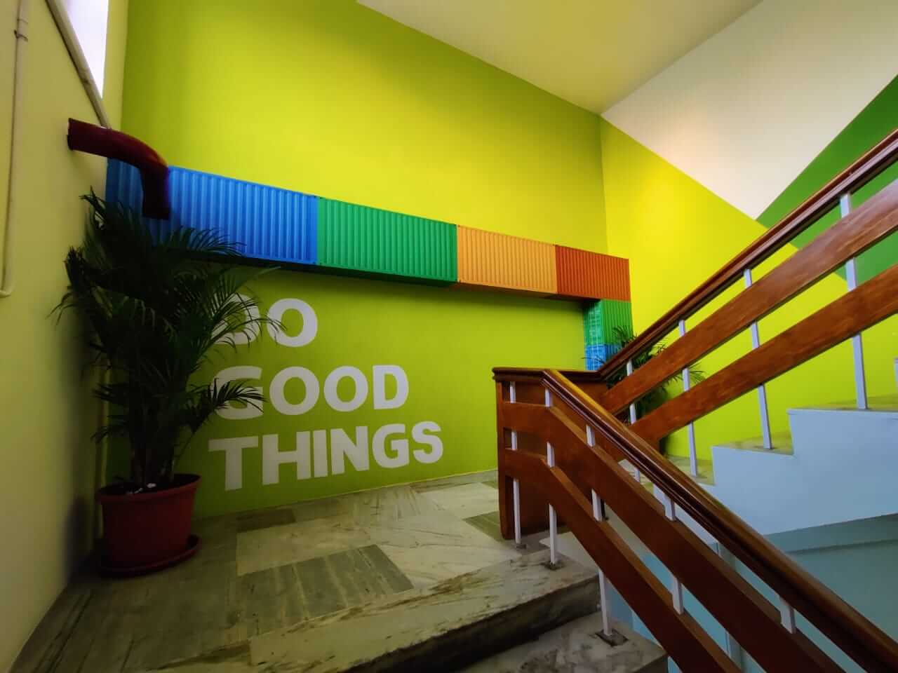
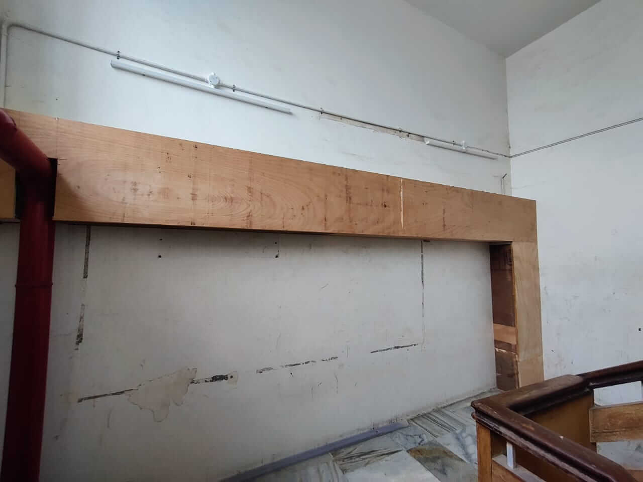
On the staircase up to the cafeteria there was an inverted L of exposed wiring running along the wall. Messy, unstructured, and completely at odds with the rest of the floor. The contractor boxed it in with a wooden board. Functional, and visually dead.

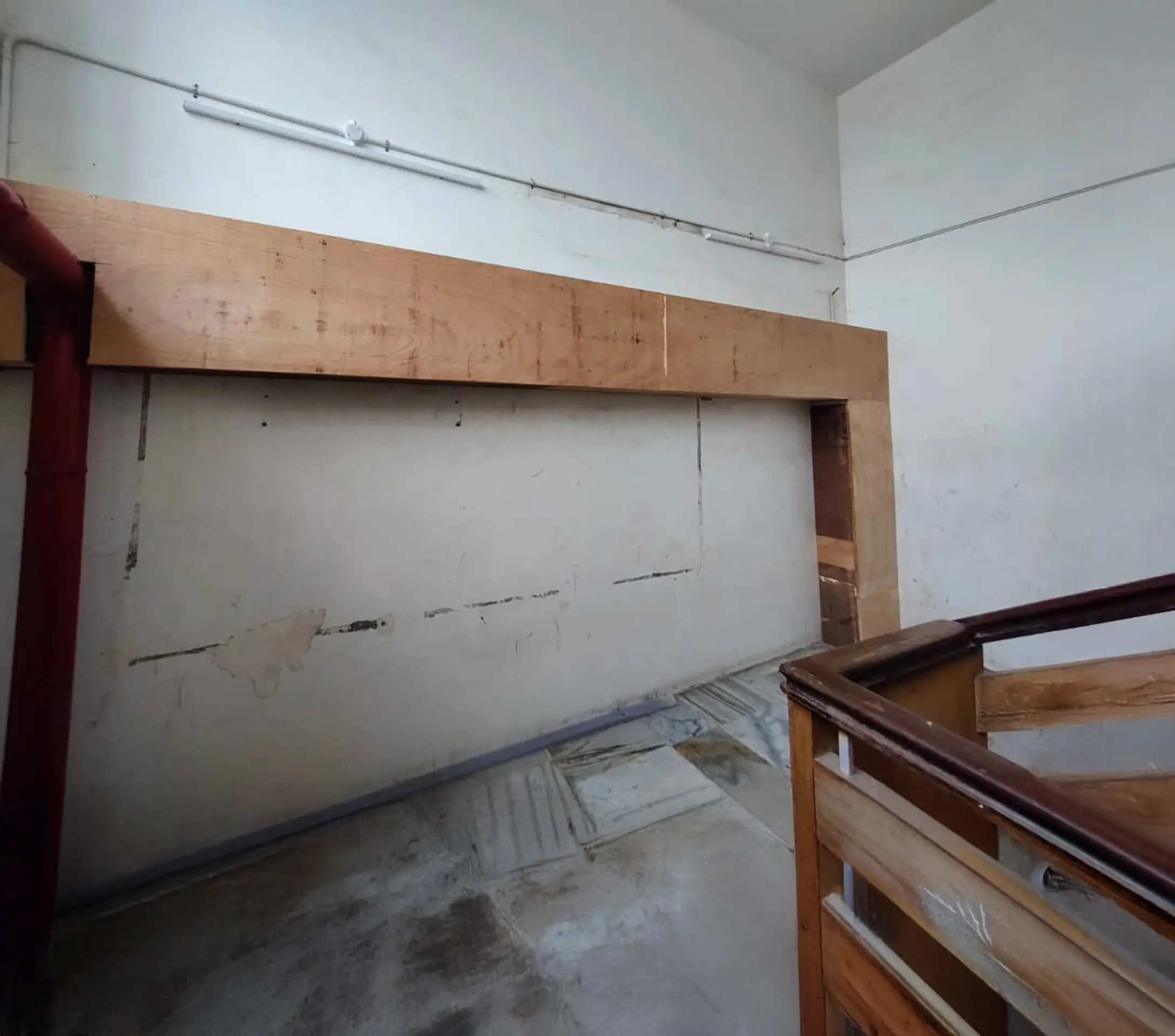
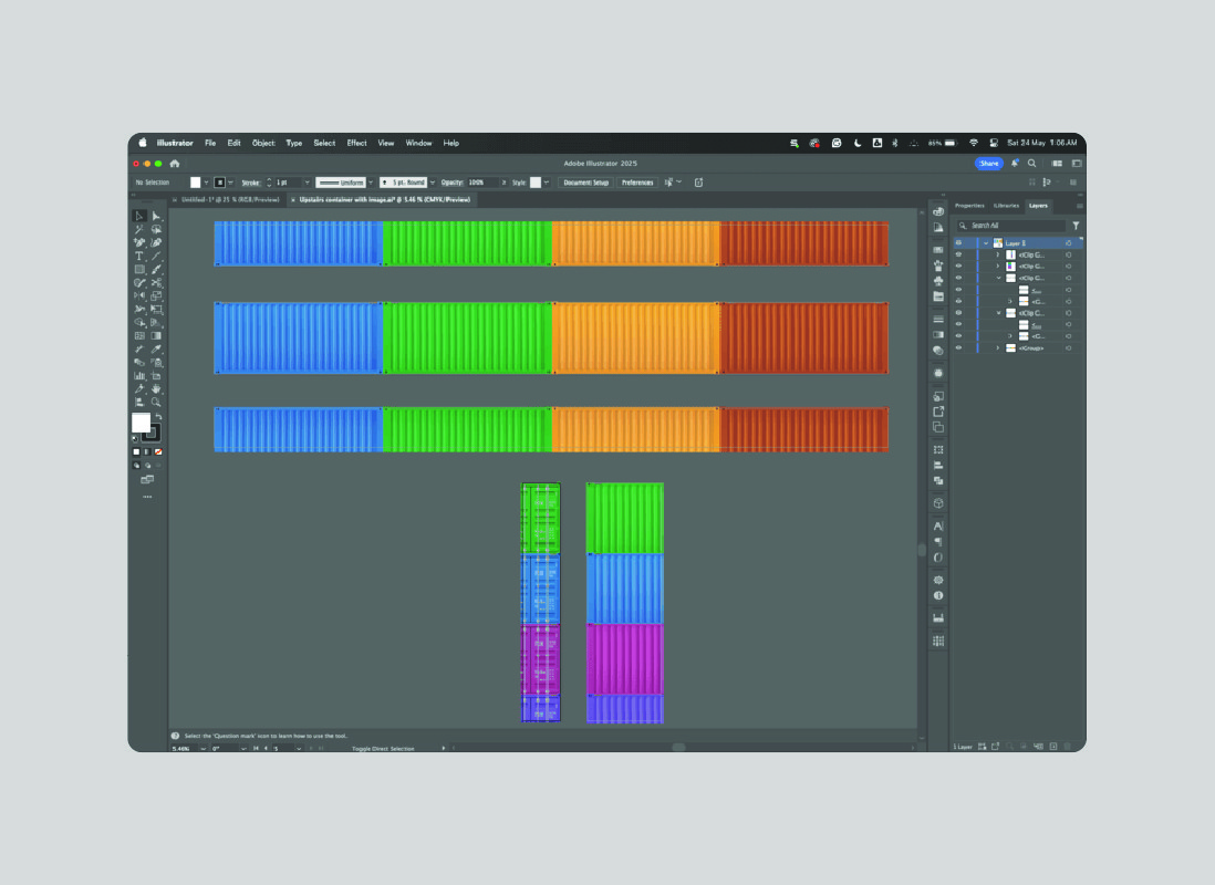
Walking past the boarded-up shape, it read like a stack of rectangles. We sell logistics software. Rectangles stacked on rectangles are shipping containers. I developed the concept, mocked it onto the site photo, and presented it.
The response was immediate. What started as a cover-up became a branded centrepiece: a metaphor for global freight movement sitting in the middle of the office.
Converted an awkward wall structure into a container-styled vinyl installation
Managed vendor execution hands-on, from spec to cut
Stayed through installation until 4 a.m. after office hours to get it exact
The vendor was impressed enough to show the finished work to his other clients
Impact
Employees adopted the city names immediately. Florida and New York entered everyday conversation without any rollout or announcement.
Stakeholders started walking guests through the office deliberately. Visitors consistently commented on the graphics.
The CEO told me directly: “You’ve left your footprints in this office. You’re a valuable asset.”
Photos of the space went into hiring material. More visibility, and a stronger first impression on candidates.
Our printing partner called the container stack near the cafeteria “wonderful creativity” and showed it to his other clients.
The floor stopped feeling like a rented shell. It started feeling like somewhere people wanted to be.
At the annual company meet, this project was recognised in front of the whole organisation. It started as an unscoped side request and ended as the thing the company chose to celebrate that year.

Learnings
I came from designing for screens, where everything can change. Print can’t. Learning materials, production, and installation changed how carefully I prepare every file.
Hierarchy, wayfinding, and clarity matter just as much in physical spaces as they do in digital products. Good design principles work everywhere.
I mocked up every idea directly onto site photos, so stakeholders could see the final outcome instead of imagining it. That kept approvals fast and aligned.
What started as a one-line brief became six weeks of work I shaped end to end. By the end, people across the office wanted to know who designed it.
thank you!
Whether you're launching a new product or refining an existing digital product, I'm here to help. Share the details about your project and I'll get back to you to work something out.