
Ready to Elevate Your Product Experience ?
Whether you're launching a new product or refining an existing digital product, I'm here to help. Share the details about your project and I'll get back to you to work something out.
Personal Concept Project
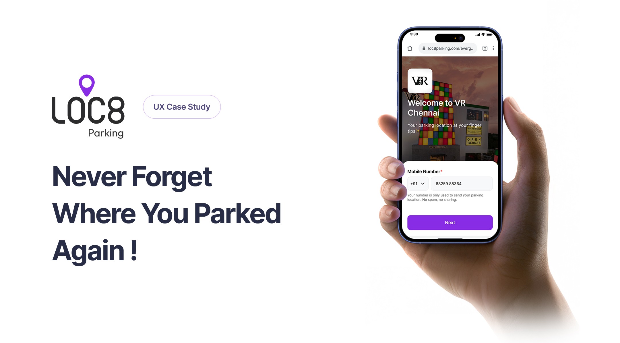
A lightweight web experience that helps people find their parked car in large indoor lots in under 60 seconds, no app required.
Role
End-to-End Product Designer
Duration
2 Weeks
Tools
Figma, Illustrator
Type
Personal Concept
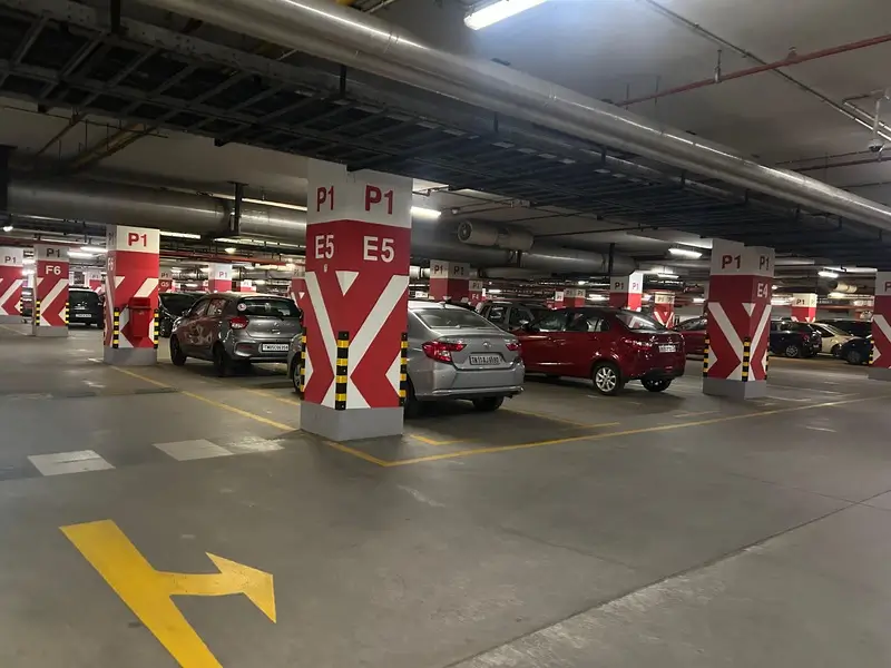
This came out of my own experience, not a hypothesis I invented at a desk. After a design event at the World Trade Center in Chennai, my friend and I went to find our car and couldn't. Every level looked identical, and we weren't even sure which floor we'd parked on. We wandered the lot for about 20 minutes, backtracking, before we found it.
What my friend said, half joking, somewhere in that 20 minutes. That's the actual moment the idea started.
The Problem
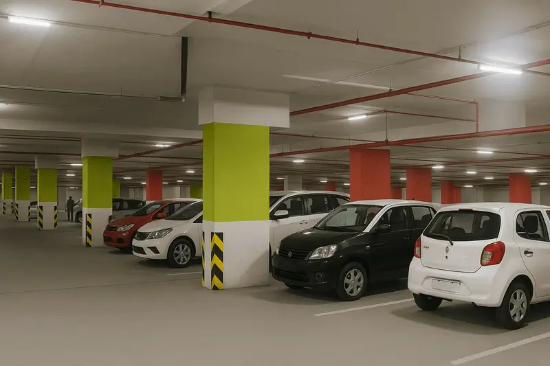
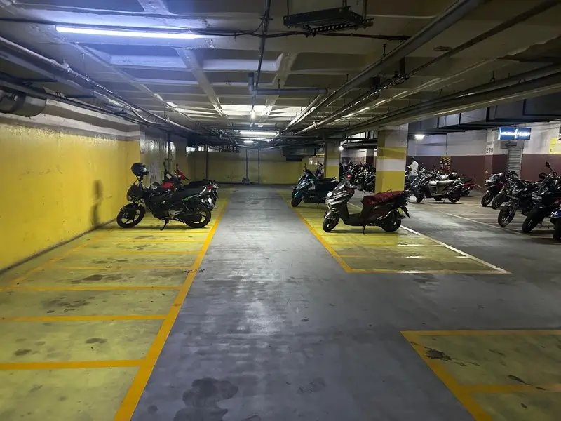
In large indoor parking areas like malls, airports, and event venues, people regularly forget where they parked. Poor signage, disorientation, and long visits make it worse, costing time and adding stress right when someone is trying to leave.
Built for anywhere with a lot large enough that people genuinely lose their car, especially where the pillars look alike or the structure spans multiple underground levels:
Shopping malls and multi-level mall parking
IT parks and large business complexes
Event and sports venues with big lots, permanent or temporary
Goals
Save a user's location in under 60 seconds
Deliver a navigation link back to their car with zero app installs
Keep the interaction to three steps: scan, confirm, go
How I Validated It
Method
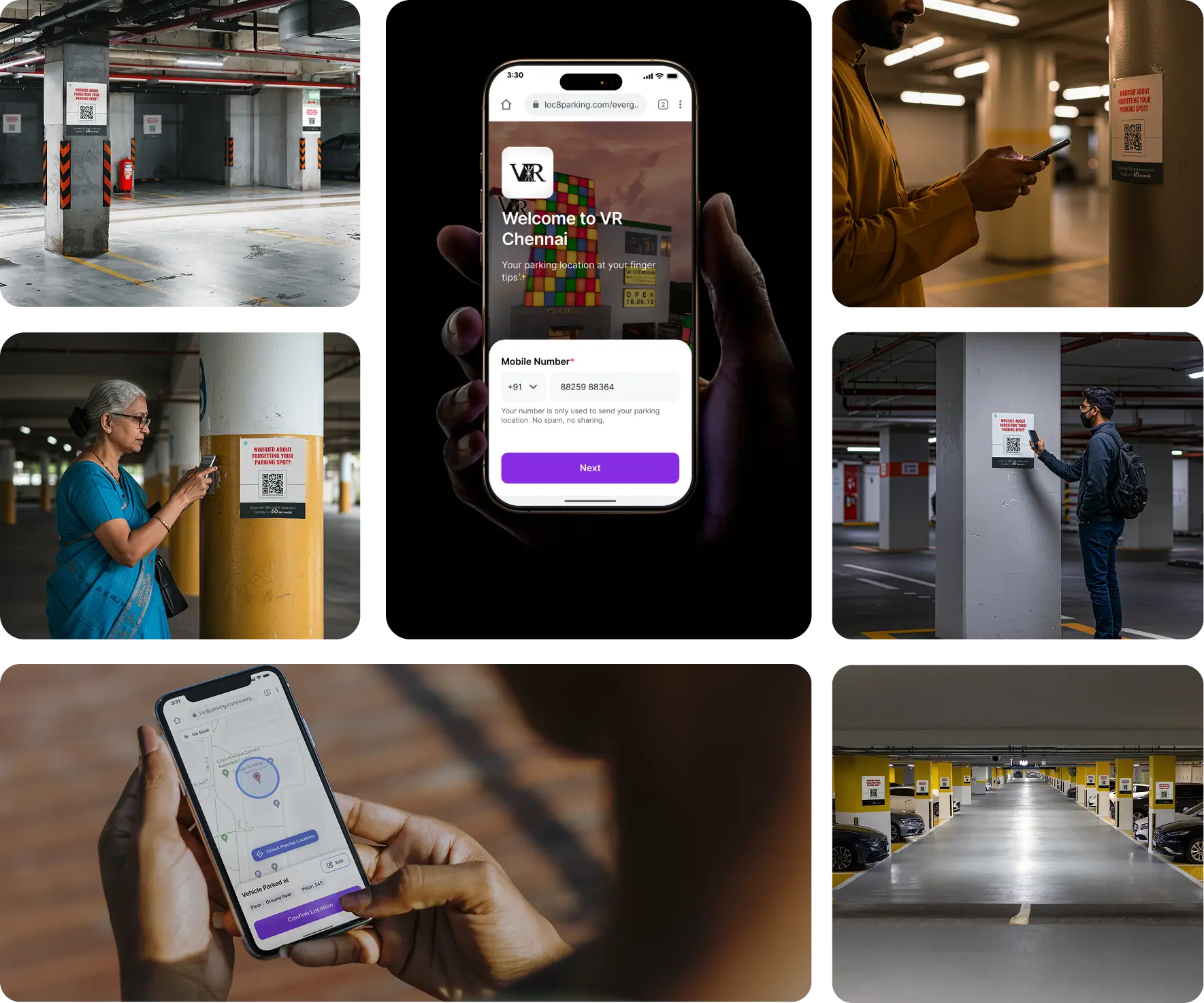
Printed real QR signage and tested it directly in an underground parking lot, watching real people scan and use it, not just a prototype on a screen
Field visits to indoor mall parking lots, informal conversations with people at exit points (no recording allowed on-site, so this is observation and notes, not quotes)
5 structured interviews over Google Meet with people who regularly visit malls, airports, and events
What held up across every source
Visited indoor parking facilities, gathered firsthand user feedback, and documented evidence confirming that many people struggle to remember where they parked.
This wasn't just a bad night for me and one friend. Every one of the 5 people I interviewed had their own version of the same experience, poor signage, look-alike surroundings, no habit of noting where they'd parked
Poor signage and repetitive, look-alike surroundings make recall harder
People don't have a habit of noting down where they parked, they rely on memory
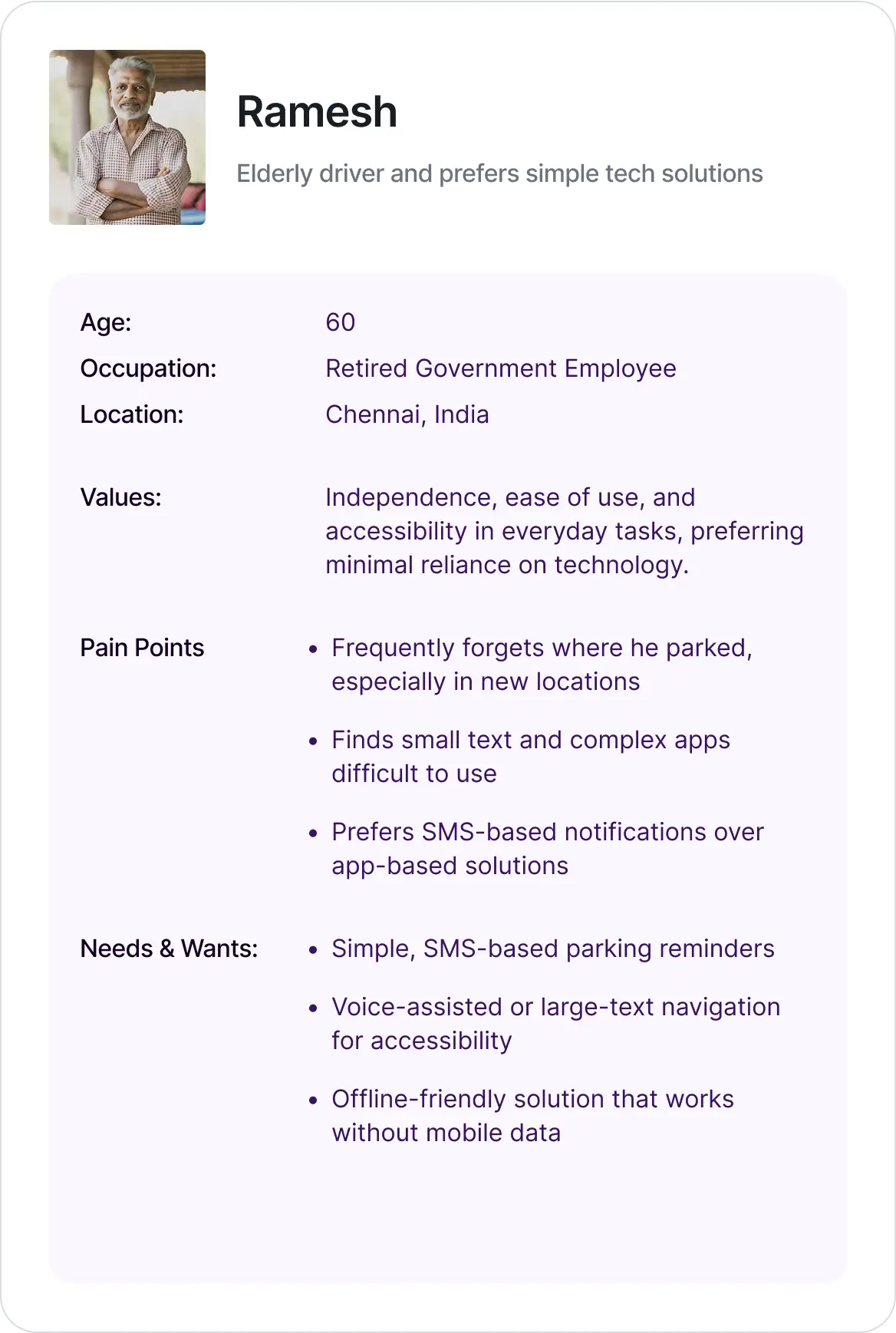
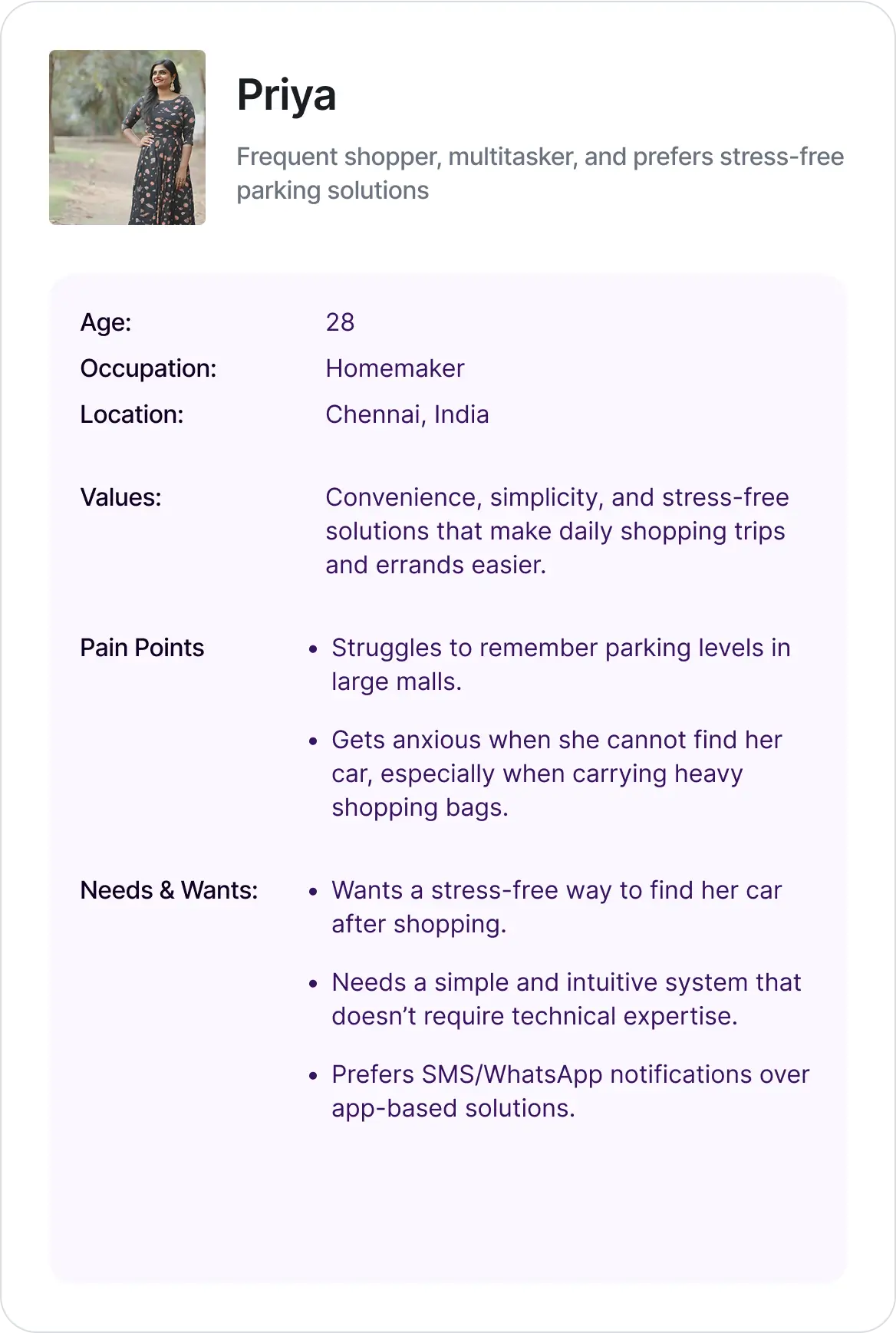
One wants speed, the other wants simplicity, but they land on the same requirement: no download, minimal typing, and a message that just works. That's the real reason the product had to be a QR-triggered mobile web flow instead of an app.
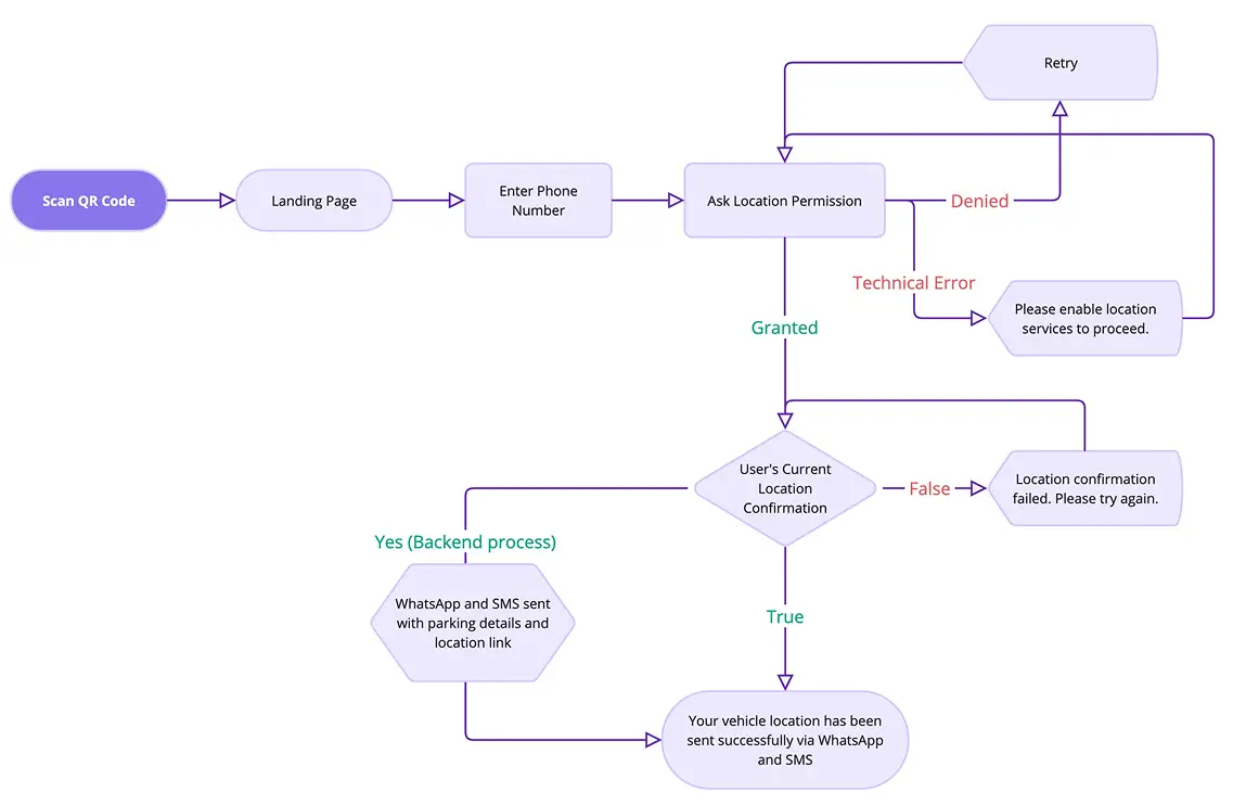
User parks, notices a QR code on a nearby pillar, and scans it. That opens a mobile web app, no install needed.
Step 1
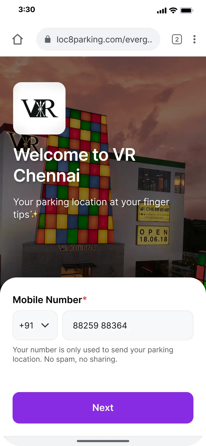
Enter phone number, allow location access
Step 2
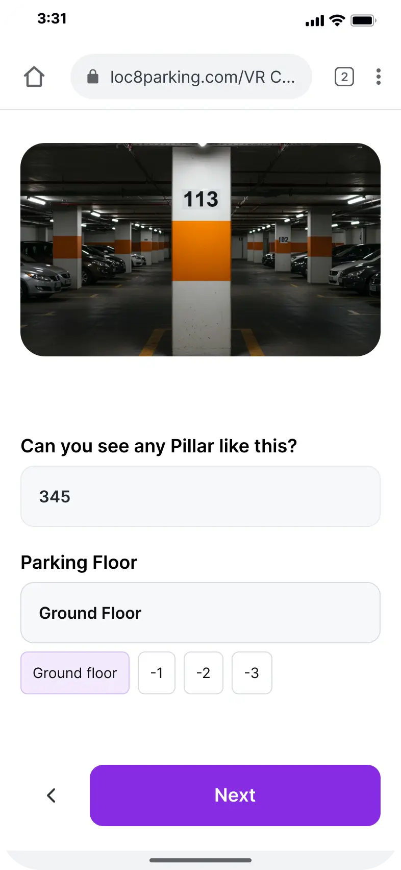
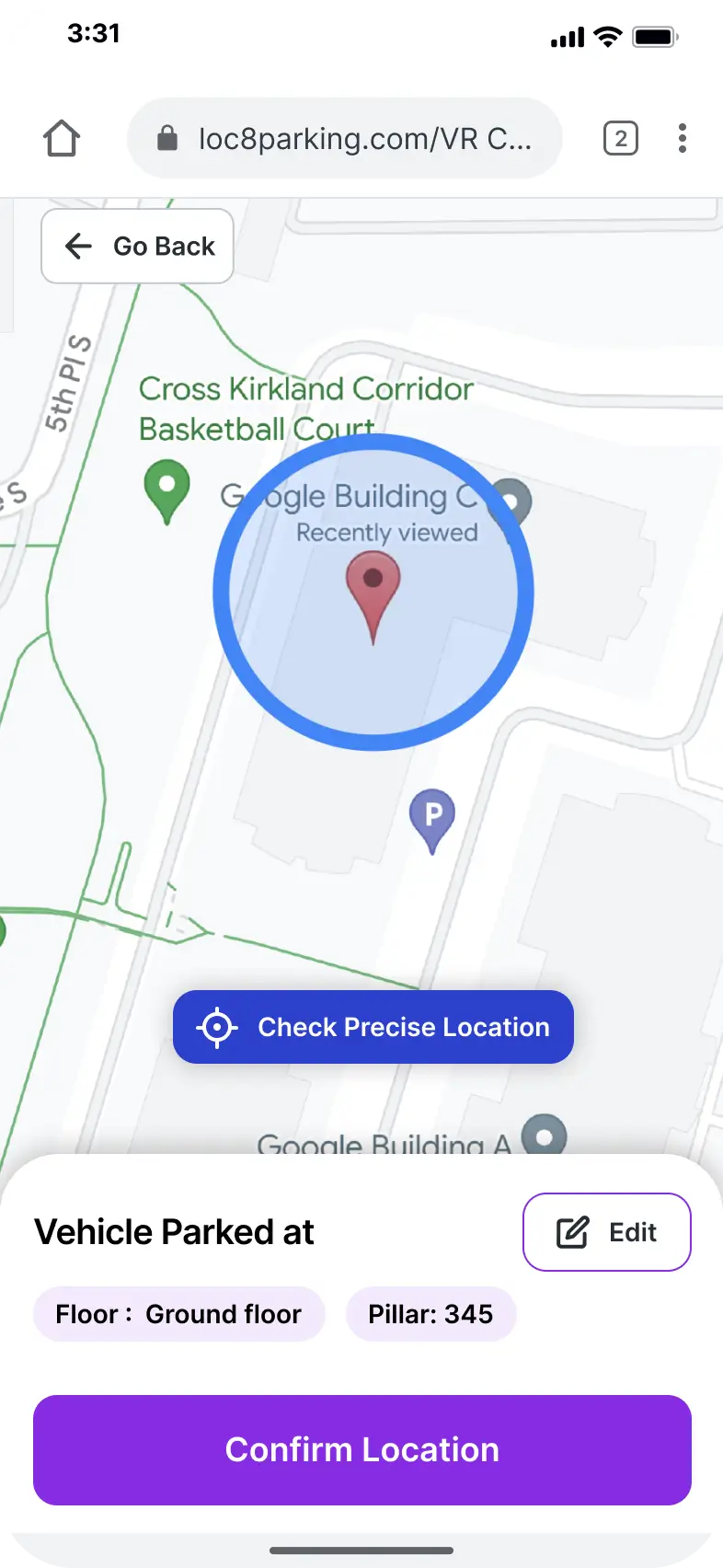
Confirm the floor and location
Step 3
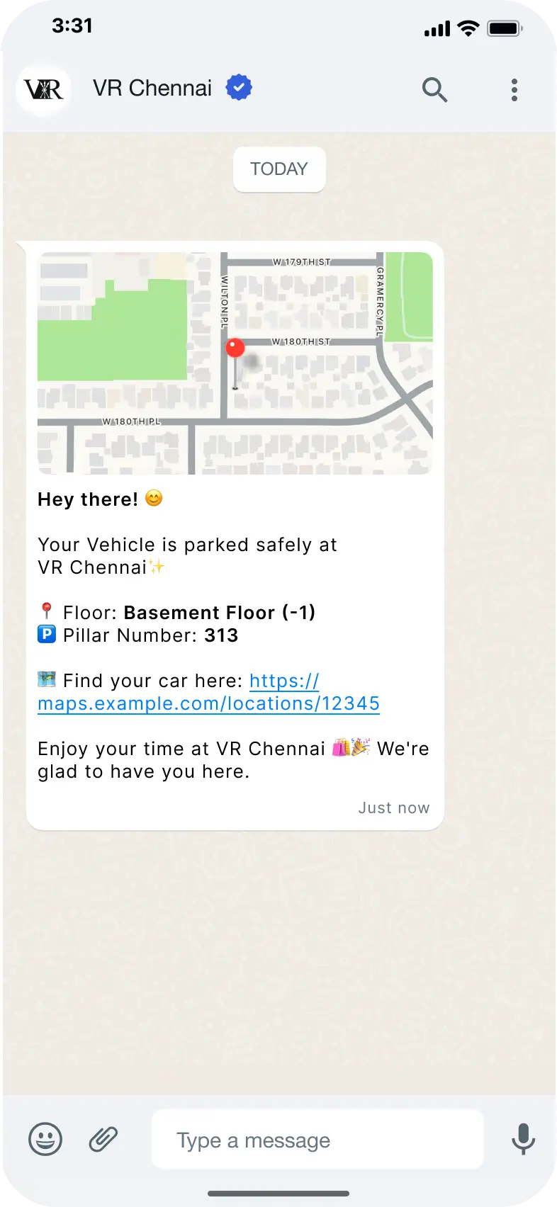
A message goes out via WhatsApp or SMS with a recall link, floor, and pillar number
Step 4
Later, open the link and follow the route back to the car
The landing page is white-labeled with the venue's own branding ("Welcome to VR Chennai"), so this isn't a single-mall tool. Any mall or parking lot owner can run it under their own logo.
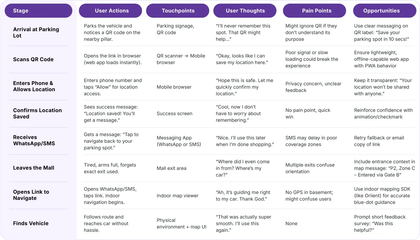
At the exit, people are tired, arms full, and often can't remember which gate they entered through, so the final message needed entrance context, not just a pin
SMS can lag in poor coverage zones, so a retry or email fallback mattered
The success screen has no pain point of its own, so it became a place to build confidence with a clear checkmark and copy, rather than just a formality between steps
The Real Challenge
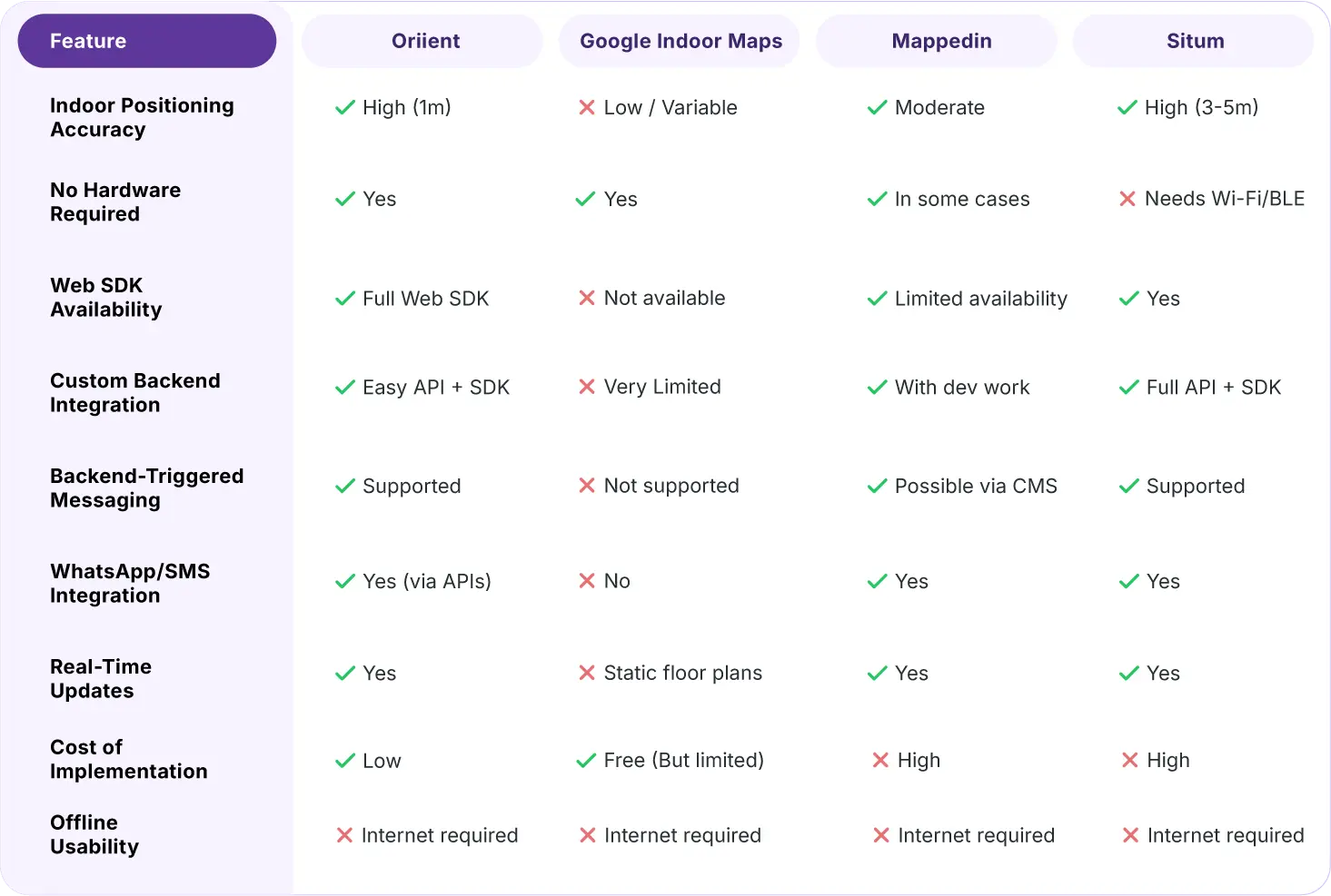
Google Maps looked like the obvious choice, but it wasn't reliable indoors. Underground GPS is inconsistent, and most malls don't support Google Indoor Maps.
So I compared four indoor navigation platforms based on accuracy, integration, hardware, and cost. Oriient stood out with 1m accuracy, no extra hardware, a full Web SDK, and easy backend integration.
The final solution combined QR codes, mobile web, and WhatsApp/SMS, with floor and pillar details included as a fallback so users could always find their car.
Feature | Decision |
|---|---|
| Platform | Mobile Web, no app |
| Trigger | QR scan from parking pillars |
| Location Capture | Location API + user confirmation |
| Backend Messaging | WhatsApp or SMS via Gupshup / Twilio |
| Indoor Navigation | Oriient, or mapped Google Indoor where available |
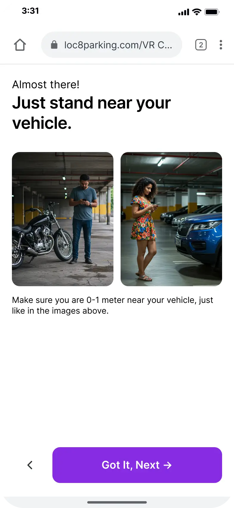
These high-fidelity mockups bring the solution to life, demonstrating how every screen contributes to a fast, intuitive, and reliable parking experience.
This is a concept project, not a shipped product, so there's no usage data to point to. If built, the model gets someone back to their car in under a minute without downloading anything, even in buildings with poor signage or no indoor GPS.
Turning scattered conversations and field notes into two distinct personas with different reasons for wanting the same solution
Designing around failure states, not just the ideal path, denied permissions, failed GPS reads, delayed messages
Choosing a technical stack by scoring it against real requirements, not by picking whatever felt easiest
Solving an indoor GPS accuracy problem with a UX pattern (the accuracy coaching screen) instead of waiting on better hardware
Loc8ate started as “I forgot where I parked.” It became a lesson in how much of product design is picking the least broken option, not the perfect one.
Whether you're launching a new product or refining an existing digital product, I'm here to help. Share the details about your project and I'll get back to you to work something out.